Let’s talk about color! Because whether it’s curtains, shades, flooring, furniture, carpets or decorations the color is the first thing you see and plays a big part in creating your desired style. That’s why Pantone selects a ‘Color of the year’.
Pantone color of the year
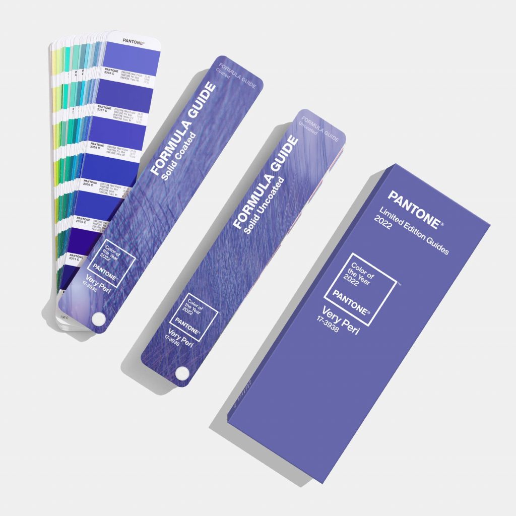
Since 2000 the company Pantone has selected a single Color of the Year in an attempt to reflect the atmosphere of the world. This year the color is: Very Peri, a warming, bold lavender tone. Many things are being taken into account prior to selecting a color. Things like for example; art, film, travel, current events and socio-economic conditions.

express yourself
According to Laurie Pressman, Vice President of the Pantone Color Institute;
“The Pantone Color of the Year reflects what is taking place in our global culture, expressing what people are looking for that color can hope to answer. Creating a new color for the first time in the history of our Pantone Color of the Year educational color program reflects the global innovation and transformation taking place. As society continues to recognize color as a critical form of communication, and a way to express and affect ideas and emotions and engage and connect, the complexity of this new red violet infused blue hue highlights the expansive possibilities that lay before us”

Lavender color at Ackerman
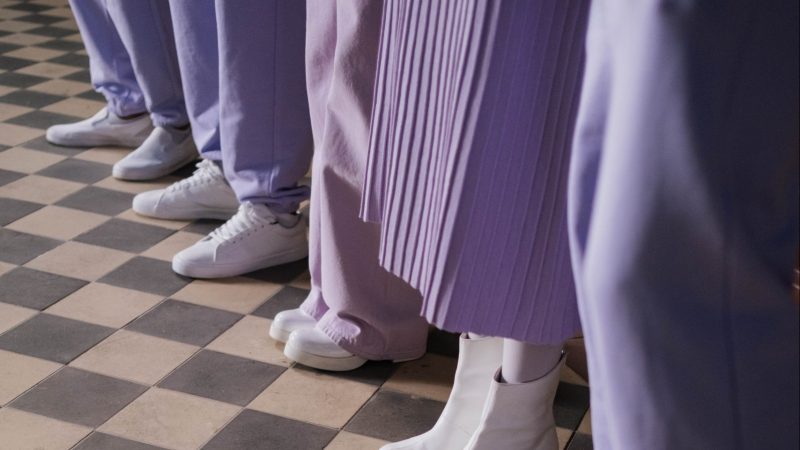
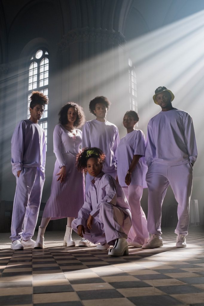
This color is fancyyy! It’s the perfect color to paint your bedroom or office, since it encourages creativity and who doesn’t want to be creative? Lavender color in general represents purity, silence, devotion, grace, serenity and calmness.
At Ackerman you can find a variety of fabrics in this beautiful color or similar to this color. Want a statement piece in your space? Reupholster that sofa or chair of yours that you wanted to do for a long time. What about tailored window treatments for your favorite room? We can do that, including professional installation. Integrate this color in your home by matching your bed pillow and your window treatments.

Mix and Match with Ackerman
This is a really versatile color that goes with different color palettes. This is why Pantone created four unique and exclusive palettes that bring the best out of Very Peri in different ways. Click the link to see Pantone’s color palettes: https://bit.ly/32xwBaH. This way you can mix and match colors for your desired style.
If you are planning to update your office or living space this is the best color that you can choose. Also, you can select colors from the Pantone color palette and buy your fabrics, home accessories or window treatments.
Give your home the love it needs by using this beautiful color or in combination with the palettes.
Leave a Reply